Checkboxes allow the user to select one or more items from a set.

Design guidelines
Usage
When to use checkboxes
Use checkboxes when you want users to:
- Select one or multiple items from a list.
- Open a list containing sub-selections.
Do
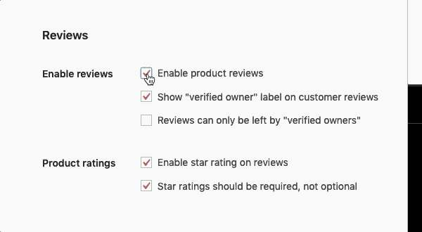
Use checkboxes when users can select multiple items from a list. They let users select more than one item.

Don’t
Don’t use toggles when a list consists of multiple options. Use checkboxes — they take up less space.
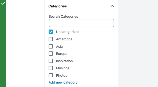
Checkboxes can be used to open a list containing sub-selections.
Parent and child checkboxes
Checkboxes can have a parent-child relationship, with secondary options nested under primary options.
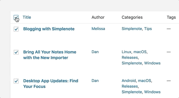
When the parent checkbox is checked, all the child checkboxes are checked. When a parent checkbox is unchecked, all the child checkboxes are unchecked.
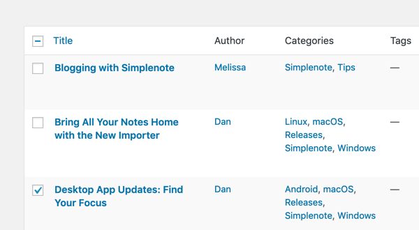
If only a few child checkboxes are checked, the parent checkbox becomes a mixed checkbox.
Development guidelines
Usage
Render an is author checkbox:
import { useState } from 'react';
import { CheckboxControl } from '@wordpress/components';

const MyCheckboxControl = () => {
    const [ isChecked, setChecked ] = useState( true );
    return (
        <CheckboxControl
            label="Is author"
            help="Is the user a author or not?"
            checked={ isChecked }
            onChange={ setChecked }
        />
    );
};
Props
The set of props accepted by the component will be specified below.
Props not included in this set will be applied to the input element.
label: string
A label for the input field, that appears at the side of the checkbox.
The prop will be rendered as content a label element.
If no prop is passed an empty label is rendered.
- Required: No
help: string|Element
If this property is added, a help text will be generated using help property as the content.
- Required: No
checked: boolean
If checked is true the checkbox will be checked. If checked is false the checkbox will be unchecked.
If no value is passed the checkbox will be unchecked.
- Required: No
onChange: function
A function that receives the checked state (boolean) as input.
- Required: Yes
indeterminate: boolean
If indeterminate is true the state of the checkbox will be indeterminate.
- Required: No
Related components
- To select one option from a set, and you want to show all the available options at once, use the
RadioControlcomponent. - To toggle a single setting on or off, use the
FormTogglecomponent.