August is a big month for WordPress. Version 7.1 is scheduled to land on August 19, and it’s arriving on the last day of WordCamp US in Phoenix, which runs August 16–19. Release day during the flagship event of the year is a nice bit of scheduling, and if you’re going to be there, you’ll get to watch it happen live.
Both RC1 and RC2 have shipped in the last week. That means the feature set is locked and the Field Guide is out.
Two security releases also landed in the past month. WordPress 7.0.2 arrived on July 17 to address one critical and one high severity issue. The severity was high enough that WordPress.org enabled forced updates for affected versions. Then WordPress 7.0.3 shipped on August 6 with a dozen more fixes. If any site you maintain somehow missed both auto-updates, go handle that before you read the rest of this post.
With nine days left before 7.1 ships, this is your last comfortable window to test your plugins and themes against it. Let’s get into what’s new.
As always, you can test the latest by running WordPress trunk along with the newest Gutenberg release, or by spinning up a Playground instance with no setup at all.
Table of Contents
Highlights
The 7.1 Field Guide is out
The WordPress 7.1 Field Guide is published, and it is the single most important thing to read this month. It collects every release dev note in one place: Media, Accessibility, the Abilities API, Global Styles, the SVG Icon API, DataViews and View Config, the Editor, the Design System, the persistent admin bar, and external libraries.
The section on what didn’t make the release is equally useful. Real-time collaboration is not enabled in 7.1. The plan to hide the Classic block from the inserter was reverted. React 19 has been punted again. The On This Day dashboard widget didn’t land, and the Guidelines/Knowledge merge proposal continues to evolve. If you’ve been tracking any of those in these previous roundups, that’s where they stand.
Responsive block styles land in Core
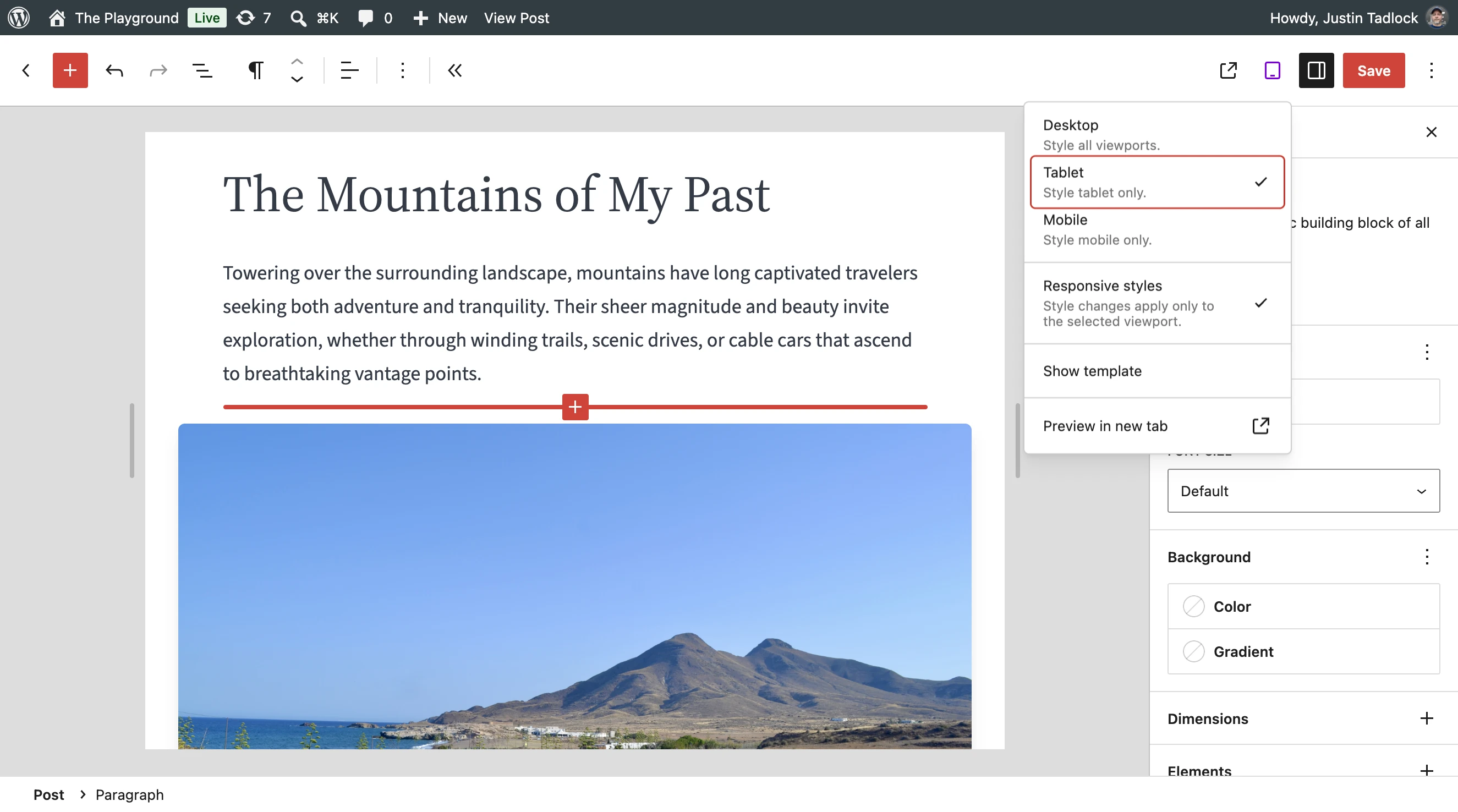
Responsive style states have been a work in progress in these roundups since spring. In WordPress 7.1, they ship.
Styles can now be defined for tablet and mobile viewports, both in Global Styles per block type and on individual block instances. In theme.json, they’re nested under @mobile and @tablet keys:
"styles": {
	"blocks": {
		"core/group": {
			"spacing": {
				"padding": { "top": "3rem" }
			},
			"@mobile": {
				"spacing": {
					"padding": { "top": "1rem" }
				}
			}
		}
	}
}
There is no @desktop key, and that’s on purpose. The block’s default style is the desktop style, and it continues to apply at every viewport for any property you don’t override.
The part you might’ve been waiting for: themes can now configure the breakpoints themselves via a new top-level settings.viewport property in theme.json. The defaults are 480px for mobile and 782px for tablet. The values must be non-negative lengths in px, em, or rem. CSS functions, percentages, and unitless values are ignored. And if the tablet value is equal to or lower than the mobile value, only mobile is used. It’s a top-level setting, so you can’t configure it per block type.
Blocks that use standard block supports get responsive styles for free. That covers typography, color, background, border, dimensions, spacing, and layout. Blocks with custom style controls do not. That’s the line to check your own blocks against.
You can also turn off responsive editing for users with a quick filter:
add_filter( 'block_editor_settings_all', 'example_disable_responsive_editing' );

function example_disable_responsive_editing( $settings ) {
	$settings['responsiveEditingEnabled'] = false;
	return $settings;
}
Note that responsive styles support means changing block-level CSS in Core. Preset utility selectors are now wrapped in :where().
Pseudo and custom style states

Alongside responsive styles, another oft-requested theme dev feature has landed: support for pseudo-state styling. You can define :hover, :focus, :focus-visible, and :active in theme.json and via the editor. For now, this is limited to the Button and Navigation Link blocks.
Here’s an example of styling :hover for a Button block (with responsive styling!):
"core/button": {
	":hover": {
		"color": { "background": "var:preset|color|contrast" }
	},
	"@mobile": {
		":hover": {
			"color": { "background": "var:preset|color|contrast-2" }
		}
	}
}
There’s also an early custom states feature, currently theme.json-only with no user-facing UI, used by the Navigation Link block to style the current menu item via a -current property. Custom states use a - prefix and generate CSS that targets a class name declared through a block’s block.json selectors.states property. Worth knowing about now, even though it’s narrow today.
Like responsive editing, this has its own opt-out: the blockStatesEditingEnabled editor setting.
The SVG Icon API now public
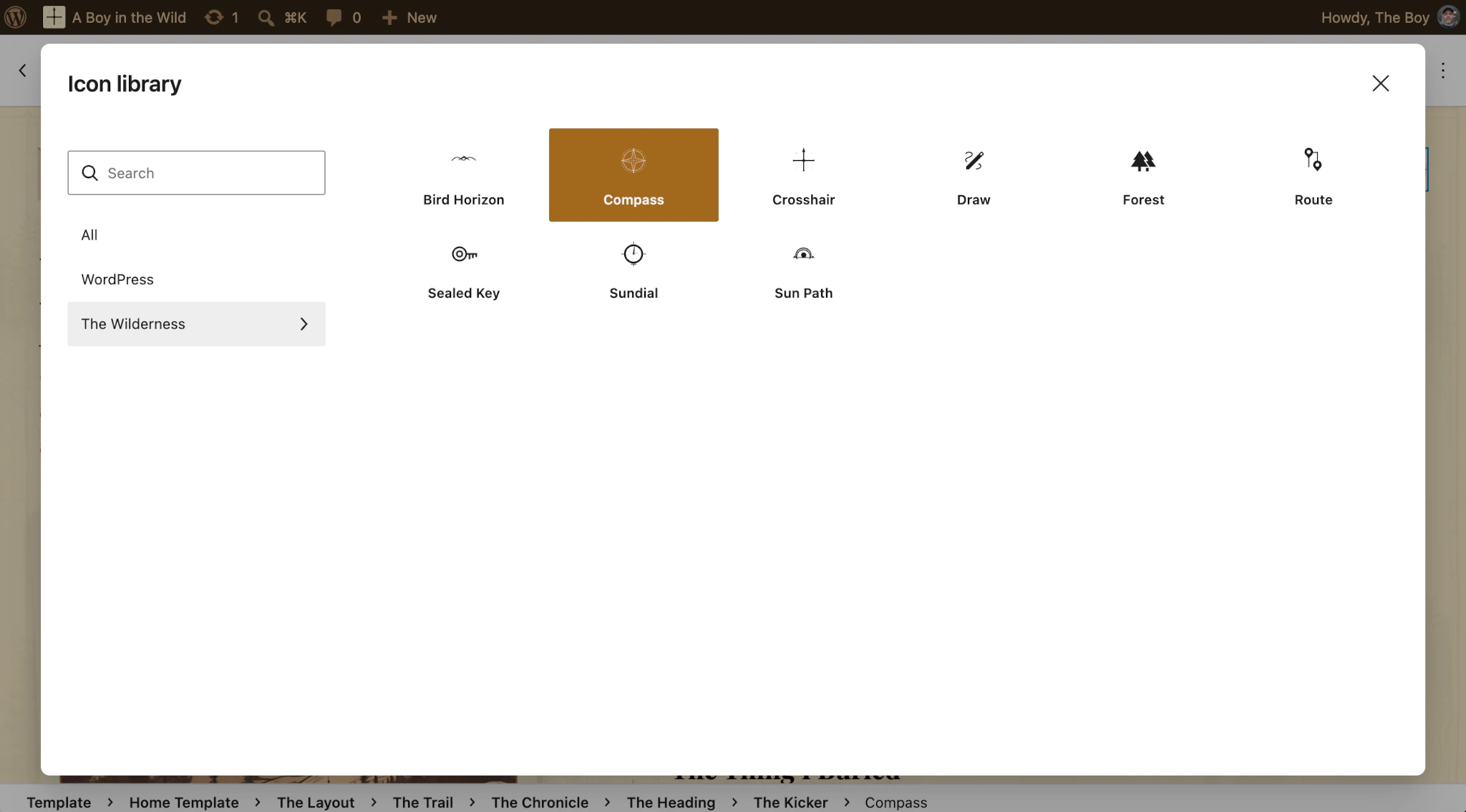
WordPress 7.0 shipped a bundled set of SVG icons for the editor and the Icon block. In 7.1, it becomes a proper public API that you can register into.
Every icon belongs to a collection, and the collection name becomes a namespace prefix, which is what keeps my-plugin/star from colliding with core/star. Register the collection with wp_register_icon_collection(), then add icons with wp_register_icon(). And wp_get_icon() renders an icon anywhere in PHP with optional size, class, and label arguments.
There are two limitations to plan around:
- Registered SVGs are sanitized through
wp_ksesagainst a deliberately conservative allowlist: only<svg>,<path>, and<polygon>. Work to broaden the allowlist is underway. fillis only allowed on the shapes, not the outer<svg>, andwp_get_icon()doesn’t add one. Inside the Icon block this doesn’t matter, because the block stylesheet sets it to the current color. But a standalonewp_get_icon()call renders in the SVG’s own fill (black), not the surrounding text color. Recommended: supply your own CSS against the class you pass in.
The post editor is always iframed
This one has been coming since the template editor moved into an iframe in WordPress 5.8. In 7.1, the post editor takes the final step: it is always iframed, regardless of theme type, the block API versions of registered blocks, or the block API versions of blocks in the content. Sites that register legacy meta boxes are included.
In 7.0, the decision was made per post based on what blocks were inserted, which meant the editor could switch between iframed and non-iframed modes depending on content. That conditional behavior is gone.
Most blocks already work without changes. The issues that do surface almost always trace back to one root cause: the iframe has its own document and window, separate from the admin page where editor scripts run. Code reaching for the global document or window to touch the canvas is looking at the wrong document. The usual fixes are getting the canvas document from an element inside it via ownerDocument and defaultView, and using useRefEffect to attach and clean up listeners on canvas elements. The handbook’s technical considerations for the iframe editor covers the full list.
Plugins and tools
List table row headers have moved
This is the change most likely to quietly break something you maintain. In changeset 62838, the primary th scope="row" in post list tables moved from the checkbox column to the title column. The checkbox cell is now a td, the title cell is now a th carrying an aria-label with the post title, and collapsed cells in the responsive view use flex layout.
It’s a real accessibility win: screen readers now identify each row by the post rather than by a checkbox that may not even be present. But this is markup that has been largely stable since 2010, and plenty of extensions depend on it implicitly. Check any CSS or JavaScript selecting th.check-column, or expecting row actions and post titles inside a td.
The Abilities API updates
The Abilities API shipped as infrastructure in WordPress 6.9. In 7.1 it picks up nearly everything you’d need to actually build against it: a filterable execution lifecycle, custom validation, and a shared discovery pipeline. If you’re building AI integrations, automation tooling, or protocol adapters, this is the release where the API stops being a foundation and starts being a toolkit.
Five dev notes cover it, and they’re worth reading in this order:
- New execution lifecycle filters
- Abilities API improvements
- Filtering registered abilities with wp_get_abilities()
- A unified public exposure flag
- JSON Schema preparation for client compatibility
Design System theming for admin interfaces
WordPress 7.1 ships foundational support for theming admin interface components, covering color, roundness, and cursor styles. Note that this has nothing to do with the front end. “Theming” in this instance is directly related to the admin.
The wp-theme stylesheet provides a full set of semantic design tokens as CSS custom properties, so you can reference them instead of hardcoding values. The wp-theme script handle provides a ThemeProvider React component that wraps a section of a page and overrides those token values. Give it a pair of seed colors and it generates a harmonious ramp for you.
For plugin authors who’ve wanted their admin screens to carry their own brand while still looking like they belong in WordPress, this is the first real opening. The token reference lists what’s available.
Components drop the 40px opt-in for good
The __next40pxDefaultSize prop has finished its journey. It was introduced in 6.7, soft-deprecated in 6.8, and as of 7.1 it’s a no-op.
Form controls render at 40px unconditionally, and passing __next40pxDefaultSize={false} no longer opts back out to 36px. Remove the prop from your usage; there’s no replacement. If you were passing size="__unstable-large" only to get the taller control, remove that too. On BorderBoxControl, BorderControl, FontSizePicker, and ToggleGroupControl, the size prop is deprecated as well.
Accessible tooltips arrive in the admin
Tooltips have existed in the editor for a while, but not in the rest of wp-admin. WordPress 7.1 adds wp_get_tooltip() and wp_get_toggletip() to close that gap. The first gives a visible accessible name to icon-only controls; the second adds a triggerable button for extended help text. Core uses them on post meta box controls and the login screen’s “Remember Me” checkbox respectively.
The CSS loads globally, but the JavaScript only loads where Core uses it. Elsewhere, enqueue wp-tooltip for both.
Block API and editor extensibility
Several miscellaneous items are worth looking at that could affect your code:
- Block transforms can now target a specific variation via
variationName, andswitchToBlockType()accepts a variation as a third argument. __experimentalCloneSanitizedBlockand__experimentalSanitizeBlockAttributesare stabilized. The experimental names still work but now log deprecations.- Non-paginated entities now return all records. If you were getting a truncated list of ten back from
getEntityRecords(), you’ll now get everything, so check anywhere you render without your own limit. - Template parts can opt out of content-only editing with the new
disableContentOnlyForTemplatePartssetting.
Elsewhere in Gutenberg 23.6 and 23.7: block bindings share context assembly between call sites, PHP-only blocks forward the current post ID to server render, the inspector controls styles slot moved back to its previous position, and PluginPostStatusInfo is now available in the DataForm post summary. The Interactivity API also refactored its directives into self-registering modules.
Filtering Site Editor screens
Four new filters let you configure the DataViews and DataForm components powering the Pages, Templates, Parts, and Patterns screens:
get_entity_view_config_posttype_pageget_entity_view_config_posttype_wp_templateget_entity_view_config_posttype_wp_template_partget_entity_view_config_posttype_wp_block
Each can set default_view, default_layouts, view_list, and form, so you can control default layout and sort order, which layouts users can pick, the preconfigured views in the sidebar, and the Quick Edit form.
Callbacks receive a config object with methods for merging patches, and they must return the container. The dev note has a working example, and the mechanism is designed to grow to other entities. On the Gutenberg side, view config also gained version handling and stricter merge semantics.
Widget primitives
Work on the widget dashboard continued through both Gutenberg releases, mostly in the direction of typed, declarative widget definitions:
- Widget primitives now ship as a script module.
- New
WidgetAttributeFieldfor typed attribute schemas, backed by a field type registry. - The widget category is exposed through the build pipeline and REST API.
- New declarative help metadata field and relevance attribute.
title,description, andkeywordsare translated server-side.
Dashboard widgets also picked up action href sanitization and help link sanitization.
Notes and collaboration
Real-time collaboration isn’t in 7.1, but Notes picked up two features since Beta 1: email notifications for @mentions and shareable revision links. Notes are also now excluded from comment feed queries, which relates to a disclosure issue patched in 7.0.3.
Other Core changes worth a look
- The
notify_post_authorfilter now has the final say. Approval status is folded into the default, so a__return_truecallback will now also send mail for comments in moderation, spam, or trash. - The toolbar now persists across editor screens. If you extend it, test how your items behave during client-side navigation.
- Speculative loading can be configured via environment variables and constants.
_doing_it_wrong()messages inWP_Block_Type_Registry::register()gained context.get_file_data()now recognizes headers prefixed by a<?tag.- Templates gained a date field, and KSES allows autofocus on dialog elements.
React 19 is punted again
React 19 won’t ship in 7.1. It was briefly enabled in Gutenberg, then reverted after unexpected incompatibilities surfaced in how old and new versions of React interact and in how plugins consume React. WordPress 7.1 stays on 18.3.
Testing hasn’t stopped, though.
Gutenberg 23.4 and later ship an experimental flag under Settings Gutenberg that swaps in React 19 at runtime. The two failure modes to look for are bundling react/jsx-runtime directly instead of using the externalized script WordPress provides, and relying on React features removed in 19 like string refs or default props on function components. There’s also work underway to catch these automatically in Plugin Check.
WordPress Coding Standards
Two WordPressCS releases landed this month. 3.4.0 is a normal feature release, and 3.4.1 contains a security fix, so upgrade sooner rather than later.
Themes
Three new design tools
WordPress 7.1 adds two block supports and one Global Styles property, and the gradient one solves a problem theme authors have been working around for years.
background.gradient is a separate support from the existing color.gradient, and the difference is where the value lands in CSS. The old support renders through the background shorthand, which resets every background property including background-image, so a block could show a gradient or an image but never both. The new support renders through the background-image longhand instead, letting the style engine output the gradient and the image as comma-separated values in a single declaration. Opt in through block.json:
{
	"supports": {
		"background": {
			"backgroundImage": true,
			"gradient": true,
			"__experimentalDefaultControls": {
				"backgroundImage": true,
				"gradient": true
			}
		}
	}
}
Core opts Group, Accordion, Pullquote, Post Content, and Quote in for 7.1. Values live at style.background.gradient and can be set in theme.json under the background styles group, at the root or per block. safecss_filter_attr() was updated to permit the combined gradient plus url() value, so no extra filtering is needed on your end.
dimensions.minWidth follows the same pattern as minHeight, applies as CSS min-width, and picks up dimensionSizes presets when a theme provides them. Note that it’s hidden by default in the block inspector unless a block opts in through __experimentalDefaultControls, but shown by default in Global Styles. And text-shadow is now supported in Global Styles.
The Navigation block stops propagating font size
The Navigation block no longer forces its font-size configuration onto the markup of core/navigation-link, core/navigation-submenu, core/page-list, and core/home-link. The old behavior compounded badly with relative units, multiplying 1.5em into 2.25em into 3.375em down a nested dropdown, and it caused the editor canvas and the front end to disagree about typography. The block now relies on standard CSS text inheritance.
If your theme targets has-{slug}-font-size on nav items directly, the dev note includes a filter that restores the legacy classes on child blocks. The original discussion is in #76416.
Global Styles values show up in the inspector
Block inspector controls now reflect inherited Global Styles values rather than appearing empty when a value is coming from theme.json, with per-level heading element styles and link element styles for blocks that are links resolving correctly. The user-facing inheritance UI is behind a Gutenberg experiment for now, so this is one to watch rather than build against.
Two related fixes landed in the same window: presets are selected by slug so two gradients sharing a value keep their identity, and the same problem is fixed for color presets sharing a hex.
Playlist and Tabs are stable
Both blocks have been experimental for a while and have appeared in these roundups in that state. In Gutenberg 23.6, the Playlist blocks and the Tabs block were stabilized, and Tabs also picked up toolbar buttons for reordering tabs. Both are on the 7.1 roadmap. If you held off on styling them while the markup was still moving, now’s the time.
Other theme-facing changes
- Themes that use
theme.jsoncan now opt out of block visibility. - Custom CSS is output after the block library styles, and Additional CSS no longer duplicates inside a Query Loop.
calc()expressions now accept unitless zeros.- The style engine preserves important gradient declarations, and block gap handles nested array values properly.
- Term Name migrated to the text-align block support, continuing the standardization that’s been running since 7.0.
- Latest Posts gained layout and block spacing support.
- Cover can now restrict which video embed providers are allowed.
- Video handles a non-lowercase VIDEO tag in
render_block_core_video(). - Navigation Link and Submenu run their post-status check without the Gutenberg plugin active, fixing a draft and deleted links regression.
WP_Theme_JSON::to_ruleset()no longer coerces implicitly, andWP_Theme::get_post_templates()got faster for large themes.
Playground
A new interface, and a handbook to go with it
WordPress Playground has had a busy month. The most visible change is a new interface, rebuilt around managing multiple sites rather than spinning up one throwaway instance at a time. Alongside it, there’s now a proper Playground Handbook.
If you use Playground for demos, support reproductions, or testing against 7.1 RC builds, this is a good moment to kick the tires and tell them what breaks.
Programmatic site management
The new Site Manager API lets you create, list, modify, and delete Playground sites from code rather than clicking through the UI, which opens the door to scripted test matrices and automated demo environments. Worth a look if you’ve been maintaining your own wrapper around Blueprints to do something similar.
Two other resources landed:
- One Playground, three workflows covers a new version of the Playground agent skill and how guidance stays consistent across surfaces.
- A guide on importing content with Blueprints, which is something folks often ask about once they’ve built their first Blueprint.
Playground also remains the fastest way to test 7.1 without touching a server. The RC announcement links a preconfigured instance running the beta channel.
Resources
Developer Blog
Aside from the regular monthly roundup, three new posts landed on the Developer Blog in the last month:
- On-brand maintenance mode for WordPress Block Themes
- Build your first AI-Powered WordPress plugin
- Rethinking do_action(): Events as objects, hooks as class names
Developer notes
Also, be sure to catch up on the WordPress 7.1 Dev Notes that apply to your work:
- Consistent navigation in WordPress 7.1 with persistent toolbar
- Client-Side Media Processing in WordPress 7.1
- Media Library infinite scrolling is now enabled by default, with a per-user opt-out
- Text Shadow Support in Global Styles
- Editable blocks inside the Custom HTML block
- Editor components updates in WordPress 7.1
- Registering and rendering SVG icons in WordPress 7.1
- React 19: punted beyond WordPress 7.1, experiment in Gutenberg
- New Block Support in WordPress 7.1: Background Gradient (background.gradient)
- New Block Support in WordPress 7.1: Minimum Width
- New execution lifecycle filters for the Abilities API in WordPress 7.1
- jQuery UI updated to 1.14.2 in WordPress 7.1
- JSON Schema preparation for client compatibility in WordPress 7.1
- Abilities API improvements in WordPress 7.1
- Design System Theming in WordPress 7.1
- Filtering Site Editor Screens in WordPress 7.1
- Iframed Editor Changes in WordPress 7.1
- Post list tables row headers changed
- Introducing name and informational tool tips in WordPress 7.1
- A unified public exposure flag for Abilities in WordPress 7.1
- Miscellaneous Editor Changes in WordPress 7.1
- Responsive block styles and configurable viewports in WordPress 7.1
- Pseudo and custom style states in WordPress 7.1
- Filtering registered abilities with wp_get_abilities() in WordPress 7.1
- The notify_post_author filter now has the final say on post author notifications
Props to @bph and @juanmaguitar for feedback and review on this post.
Leave a Reply