TextControl components let users enter and edit text.
Design guidelines
Usage
When to use TextControls
TextControls are best used for free text entry. If you have a set of predefined options you want users to select from, it’s best to use a more constrained component, such as a SelectControl, RadioControl, CheckboxControl, or RangeControl.
Because TextControls are single-line fields, they are not suitable for collecting long responses. For those, use a text area instead.
TextControls should:
- Stand out and indicate that users can input information.
- Have clearly differentiated states (selected/unselected, active/inactive).
- Make it easy to understand the requested information and to address any errors.
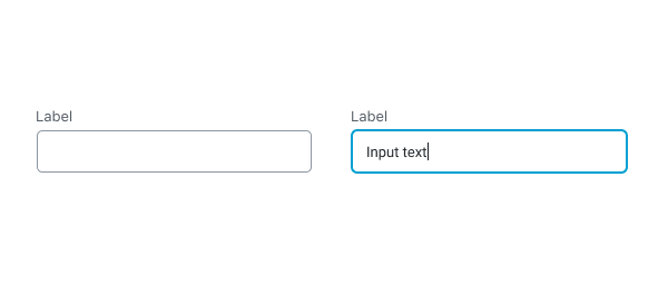
- Have visible labels; placeholder text is not an acceptable replacement for a label as it vanishes when users start typing.
Anatomy
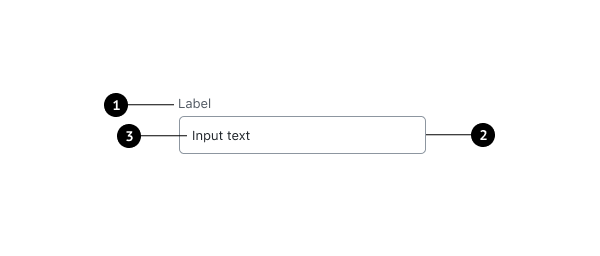
- Label
- Input container
- Input text
Label text
Label text is used to inform users as to what information is requested for a text field. Every text field should have a label. Label text should be above the input field, and always visible.
Containers
Containers improve the discoverability of text fields by creating contrast between the text field and surrounding content.

Do
A stroke around the container clearly indicates that users can input information.

Don’t
Don’t use unclear visual markers to indicate a text field.
Development guidelines
Usage
Render a user interface to input the name of an additional css class.
import { useState } from 'react';
import { TextControl } from '@wordpress/components';

const MyTextControl = () => {
    const [ className, setClassName ] = useState( '' );

    return (
        <TextControl
            label="Additional CSS Class"
            value={ className }
            onChange={ ( value ) => setClassName( value ) }
        />
    );
};
Props
The set of props accepted by the component will be specified below.
Props not included in this set will be applied to the input element.
label
If this property is added, a label will be generated using label property as the content.
- Type:
String - Required: No
hideLabelFromVision
If true, the label will only be visible to screen readers.
- Type:
Boolean - Required: No
help
If this property is added, a help text will be generated using help property as the content.
- Type:
String - Required: No
type
Type of the input element to render. Defaults to “text”.
- Type:
String - Required: No
- Default: “text”
value
The current value of the input.
- Type:
String | Number - Required: Yes
className
The class that will be added with “components-base-control” to the classes of the wrapper div.
If no className is passed only components-base-control is used.
- Type:
String - Required: No
onChange
A function that receives the value of the input.
- Type:
function - Required: Yes
Related components
- To offer users more constrained options for input, use SelectControl, RadioControl, CheckboxControl, or RangeControl.