Buttons let users take actions and make choices with a single click or tap.

Design guidelines
Usage
Buttons tell users what actions they can take and give them a way to interact with the interface. You’ll find them throughout a UI, particularly in places like:
- Modals
- Forms
- Toolbars
Best practices
Buttons should:
- Be clearly and accurately labeled.
- Clearly communicate that clicking or tapping will trigger an action.
- Use established colors appropriately. For example, only use red buttons for actions that are difficult or impossible to undo.
- Prioritize the most important actions. This helps users focus. Too many calls to action on one screen can be confusing, making users unsure what to do next.
- Have consistent locations in the interface.
Content guidelines
Buttons should be clear and predictable—users should be able to anticipate what will happen when they click a button. Never deceive a user by mislabeling a button.
Buttons text should lead with a strong verb that encourages action, and add a noun that clarifies what will actually change. The only exceptions are common actions like Save, Close, Cancel, or OK. Otherwise, use the {verb}+{noun} format to ensure that your button gives the user enough information.
Button text should also be quickly scannable — avoid unnecessary words and articles like the, an, or a.
Types
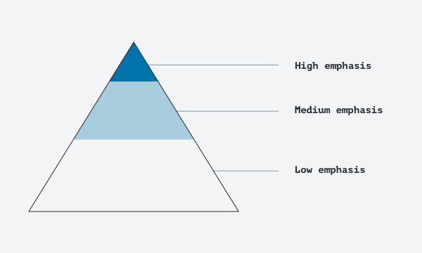
Link button
Link buttons have low emphasis. They don’t stand out much on the page, so they’re used for less-important actions. What’s less important can vary based on context, but it’s usually a supplementary action to the main action we want someone to take. Link buttons are also useful when you don’t want to distract from the content.

Default button
Default buttons have medium emphasis. The button appearance helps differentiate them from the page background, so they’re useful when you want more emphasis than a link button offers.

Primary button
Primary buttons have high emphasis. Their color fill and shadow means they pop off the background.
Since a high-emphasis button commands the most attention, a layout should contain a single primary button. This makes it clear that other buttons have less importance and helps users understand when an action requires their attention.

Text label
All button types use text labels to describe the action that happens when a user taps a button. If there’s no text label, there needs to be a label added and an icon to signify what the button does.

Do
Use color to distinguish link button labels from other text.
Don’t
Don’t wrap button text. For maximum legibility, keep text labels on a single line.
Hierarchy
A layout should contain a single prominently-located button. If multiple buttons are required, a single high-emphasis button can be joined by medium- and low-emphasis buttons mapped to less-important actions. When using multiple buttons, make sure the available state of one button doesn’t look like the disabled state of another.
A button’s level of emphasis helps determine its appearance, typography, and placement.
Placement
Use button types to express different emphasis levels for all the actions a user can perform.
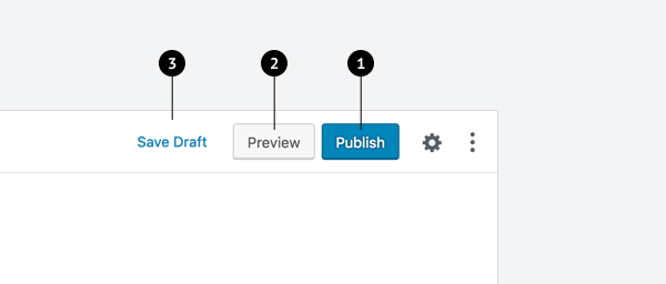
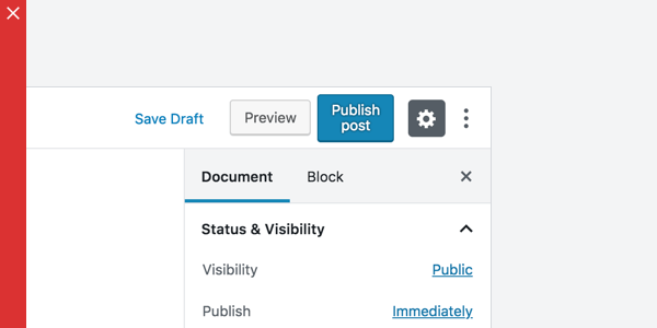
This screen layout uses:
- A primary button for high emphasis.
- A default button for medium emphasis.
- A link button for low emphasis.
Placement best practices:
- Do: When using multiple buttons in a row, show users which action is more important by placing it next to a button with a lower emphasis (e.g. a primary button next to a default button, or a default button next to a link button).
- Don’t: Don’t place two primary buttons next to one another — they compete for focus. Only use one primary button per view.
- Don’t: Don’t place a button below another button if there is space to place them side by side.
- Caution: Avoid using too many buttons on a single page. When designing pages in the app or website, think about the most important actions for users to take. Too many calls to action can cause confusion and make users unsure what to do next — we always want users to feel confident and capable.
Development guidelines
Usage
Renders a button with default style.
import { Button } from '@wordpress/components';

const MyButton = () => <Button variant="secondary">Click me!</Button>;
Props
The presence of a href prop determines whether an anchor element is rendered instead of a button.
Props not included in this set will be applied to the a or button element.
children: ReactNode
The button’s children.
- Required: No
className: string
An optional additional class name to apply to the rendered button.
- Required: No
describedBy: string
An accessible description for the button.
- Required: No
disabled: boolean
Whether the button is disabled. If true, this will force a button element to be rendered, even when an href is given.
- Required: No
href: string
If provided, renders a instead of button.
- Required: No
icon: IconProps< unknown >[ 'icon' ]
If provided, renders an Icon component inside the button.
- Required: No
iconPosition: 'left' | 'right'
If provided with icon, sets the position of icon relative to the text. Available options are left|right.
- Required: No
- Default:
left
iconSize: IconProps< unknown >[ 'size' ]
If provided with icon, sets the icon size. Please refer to the Icon component for more details regarding the default value of its size prop.
- Required: No
isBusy: boolean
Indicates activity while a action is being performed.
- Required: No
isDestructive: boolean
Renders a red text-based button style to indicate destructive behavior.
- Required: No
isLink: boolean
Deprecated: Renders a button with an anchor style.
Use variant prop with link value instead.
- Required: No
- Default:
false
isPressed: boolean
Renders a pressed button style.
If the native aria-pressed attribute is also set, it will take precedence.
- Required: No
isPrimary: boolean
Deprecated: Renders a primary button style.
Use variant prop with primary value instead.
- Required: No
- Default:
false
isSecondary: boolean
Deprecated: Renders a default button style.
Use variant prop with secondary value instead.
- Required: No
- Default:
false
isSmall: boolean
Decreases the size of the button.
Deprecated in favor of the size prop. If both props are defined, the size prop will take precedence.
- Required: No
isTertiary: boolean
Deprecated: Renders a text-based button style.
Use variant prop with tertiary value instead.
- Required: No
- Default:
false
label: string
Sets the aria-label of the component, if none is provided. Sets the Tooltip content if showTooltip is provided.
- Required: No
shortcut: string | { display: string; ariaLabel: string; }
If provided with showTooltip, appends the Shortcut label to the tooltip content. If an object is provided, it should contain display and ariaLabel keys.
- Required: No
showTooltip: boolean
If provided, renders a Tooltip component for the button.
- Required: No
size: 'default' | 'compact' | 'small'
The size of the button.
'default': For normal text-label buttons, unless it is a toggle button.'compact': For toggle buttons, icon buttons, and buttons when used in context of either.'small': For icon buttons associated with more advanced or auxiliary features.
If the deprecated isSmall prop is also defined, this prop will take precedence.
- Required: No
- Default:
'default'
target: string
If provided with href, sets the target attribute to the a.
- Required: No
text: string
If provided, displays the given text inside the button. If the button contains children elements, the text is displayed before them.
- Required: No
tooltipPosition: PopoverProps[ 'position' ]
If provided withshowTooltip, sets the position of the tooltip. Please refer to the Tooltip component for more details regarding the defaults.
- Required: No
variant: 'primary' | 'secondary' | 'tertiary' | 'link'
Specifies the button’s style. The accepted values are 'primary' (the primary button styles), 'secondary' (the default button styles), 'tertiary' (the text-based button styles), and 'link' (the link button styles).
- Required: No
Related components
- To group buttons together, use the ButtonGroup component.